
Sometimes, there is nothing more frustrating than finding yourself reading a 404 (page not found) message on a website as a user. 404 error pages can be extremely frustrating and confusing. It can often be the last impression left on a user. In most cases, users are not sure how they ended up on the error page, and worse, how to fix the mistake. Luckily, there are strategies that companies can implement on their websites to make 404 pages an extension of the user’s journey rather than a dead end. In this article, you will learn three quick and easy tips on how to turn an error into an opportunity.
1. Everybody Loves Options
Everyone loves options, no matter what. Whether you are talking about wardrobe options, shoe options, and even alternate options on your 404 page! When users hit this page, it is by accident so options are crucial to get the user back on track. The goal is to get the user back on the page of your website that will help them complete the goal of their visit. This is why providing options is essential.
The first option that can be added to your 404 page – which provides a plethora of options without cluttering it – is a search bar. Providing your user with a search bar is a surefire way to get your user to the target page. This is a one stop shop and organized way to offer the user options without overwhelming them. Assuming your site search functionality is optimized, this will get your user back on track in no time.
The second option would be to add in contact information. For mobile users, adding a clickable phone number so users can reach out to your team for assistance is ideal, along with a link to the Contact Us page. Making it easy for the user to be in contact with your team is invaluable.
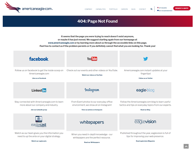
A third option would be to gather a list of top converting pages, pages with highest traffic or perhaps pages that you want to give more visibility to, and add these as alternative options on the 404 page. This also can be changed as often as needed. For instance, if you have a sale going on and a lot of traffic is being driven to the sale landing page, add that as an option on the 404 page. Maybe the user meant to go there, or maybe the user did not know there was a sale going on but now does and is going to make a purchase they originally had not intended.
Options are key when encouraging users to continue on their journey on your website after they have hit a minor hiccup.
2. Customize Your 404 Page
Many websites do not reach their potential in regard to their 404 page design. Rather, they forget about it and do not put much effort or thought behind it. This is a big mistake and can have very detrimental effects on your user’s experience. Using this space to promote your brand and personality with users will go a long way. Companies can often disregard this and do not see the value which is a lost opportunity for countless, potential customers.
Branding Opportunity - Use this space as a way to give more exposure to your brand. This area is a blank slate for your team to add some branding flare to this page. You can also offer a suite of social media options where users can learn more about your brand via various channels.
Explain What a 404 Page is with Personality – Users will respond in a more positive manner when websites have a funny or personalized error page. Your users also will not mind when they do hit a 404 page. It’s more likely to be a pleasant experience if it makes them laugh or smile. Ala, Amazon’s 404 error page showcases the “dogs of Amazon.” Who doesn’t love to see puppies?!
Customize Graphics – Make sure that you customize your graphics on this page which will make it more interesting and more helpful to users. It will also engage them more and make them opt in to reading the message on the screen along with taking an action – which is what we need users to do once they’ve found themselves on an error page.
3. Be Crystal Clear
When a user hits this page on the website, the cause is either user error or website error. Either way, it is frustrating to the user. Majority of people will not understand what ‘404’ means when they hit this page. This is why it is imperative to provide users an explanation as to what happened without using industry lingo. Be kind and helpful to your users while giving them information that will help them move forward.
Apologies are always nice to extend to your users which takes away from the user feeling like they did something wrong. An apology plus humor plus options is the trifecta your users need!
At the end of the day, you want your users to be able to explore your website with minimal aggravation and with lots of positive results. This is extremely important to drive conversions on your website, but also to gain repeat business. Following these three simple steps will help improve the user experience on your website which will inherently result in increased conversions, boost in traffic, and continued success.
Americaneagle.com is well versed in website design – it’s at the core of what we do. Through unique methodology – from user experience to engineering – we’re able to deliver one-of-a-kind design balanced to empower your brand across all channels. Contact us today to learn how we can help your business succeed.